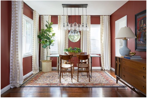
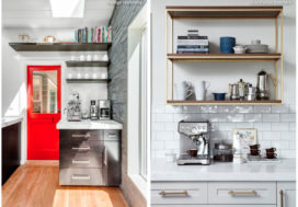
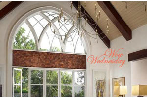
While PANTONE gave us their top pick for the 2019 color of the year, many paint suppliers have as well. Here is an article from Houzz.com that lists out several of the paint colors that have been selected, and offers tips on how to best use them within the home.
Personally, I’m trying to figure out a way to use some of those deep peacock-y colors in my next home! I think a creamy-white trim is definitely the go-to accent for peacock blues. Both the blue & the white just pop then. If you get the right shade of peacock blue, Living Coral would be a fantastic accent as well!
Of course, a soft gray like Metropolitan from Benjamin Moore would also coordinate nicely, and be far more neutral than peacock blue. I am glad to see that bolder colors – while still being pulled from a softer palate – are being brought to the forefront for design. Everything has been so neutral for so long now that it’s really nice to see some slightly more intense colors than gray, taupe, & beige.
Do you like any of these colors? Can you see yourself embracing any of them in your home – maybe not on your walls, but in accents like pillows & blankets or furnishings? I was gifted with a set of peacock blue chairs a few years ago, which add a pop of color to an otherwise fairly neutral living room. Interestingly enough, they coordinate beautifully to the cranberry velvet drapes & pillows that I already had in that room.
Isn’t playing around with color fun?
This is part of our Design Tips Series.


